My role
I was the Design System Lead responsible for design system guidance, front-end design, front-end design, front-end development, systems thinking, user experience, and user research
Tools and software used
Confluence, GitHub, HTML, JavaScript, Jira, React, SASS, Sketch, Typescript, and U.S. Web Design System
Challenge
The CMS Design System required modernization to improve scalability, consistency, accessibility, and adoption. The existing system lacked robust design tokens, had inconsistent documentation, and was challenging for teams to integrate efficiently. Additionally, CMS was not operating a single design system but rather a network of interconnected systems spanning CMS.gov, Healthcare.gov, and Medicare.gov, each with unique constraints and requirements.
Research & discovery
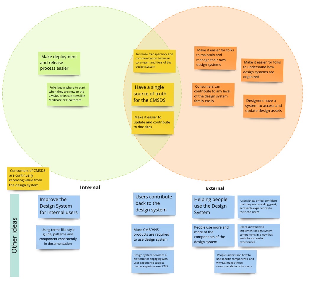
To ensure our efforts aligned with user needs, we conducted multiple rounds of defining outcomes and SMART objectives to guide our explorations. A key part of this process was mapping where internal and external user needs intersected, helping us focus on high-impact areas.
We also conducted extensive audits of component usage across applications. By analyzing how components were being used in Healthcare.gov and Medicare.gov products, we identified critical gaps in the design system. These audits directly influenced our future work, shaping both improvements to existing components and the introduction of new ones.
For example, an audit of the tooltip component across Healthcare and Medicare products revealed inconsistencies that led to usability issues. This insight helped refine our approach to tooltips, error message placement, and help content patterns like help drawer links and external links.
Strategy & approach
With research-backed insights, we developed a roadmap to address key challenges and improve design system adoption:
-
Expand team support: Secured dedicated engineering and product resources, increasing the design system team from 4 to 8 full-time members.
-
Simplify system integration: Reduced the number of required NPM packages from three to one, making adoption easier for development teams.
-
Unify documentation: Consolidate six fragmented documentation sources into a single, user-friendly reference.
-
Introduce design tokens and theming: Standardize design implementation across platforms while enabling flexibility.
-
Improve design-to-development collaboration: Integrate Storybook to enhance consistency between design and development.
-
Enhance accessibility and usability: Conduct systematic audits to ensure compliance and usability improvements.
Execution
To execute our strategy effectively, we focused on key implementation areas:
Key Features Implemented
-
Secured dedicated engineering and product support: Expanded the design system team to accelerate development and governance.
-
Simplified NPM package usage: Consolidated dependencies for streamlined adoption.
-
Unified documentation sites: Merged fragmented resources into a central, easy-to-navigate hub.
-
Implemented design tokens and theming: Reduced custom styling efforts and improved design system flexibility.
-
Integrated Storybook: Improved alignment between design and development, reducing inconsistencies.
-
Standardized browser styles and component spacing: Ensured consistency across different browsers and interfaces.
-
Developed new components: Introduced dropdown menus and improved form components to enhance usability.
-
Enhanced accessibility and usability audits: Made significant design updates, bug fixes, and improvements to component accessibility.
-
Improved documentation with version switcher: Enabled easier access to different system versions for developers and designers.
In addition to these structural improvements, we also identified areas for further user testing, such as:
-
Optimal placement of error messages.
-
Effectiveness of help content patterns (e.g., tooltips and help drawer links).
-
Improving external link guidance.
Outcomes & impact
-
Improved onboarding documentation, leading to faster product team ramp-up times.
-
Introduced design tokens and theming, reducing custom styling effort for product teams.
-
Implemented new dropdown components, improving user interaction flexibility.
-
Upgraded documentation site with a version switcher, making it easier for users to navigate between system updates.